A metal tin starts with three advantages no other packaging format can copy: it is heavy in the hand, it survives years of reuse, and it photographs well. Yet most custom tin box design projects still disappoint — not because the idea was wrong, but because the decisions were made in the wrong order. Teams pick a finish before they pick a structure, approve artwork before they confirm what the tooling can actually do, and only discover the real cost drivers when the quote comes back higher than expected.
This guide reorganises the ten design ideas that consistently work into the order you should actually decide them. Every idea comes with what it solves, what it costs, and what goes wrong in production. Every photo is a real production case, not a mockup. By the end you will have a design you can brief, a spec sheet you can copy, and a realistic view of the timeline.

Start Here: The 30-Second Tin Box Design Shortcut
If you read nothing else, this table answers the question most brand teams actually have: which idea is for me?
| Your goal | Start with this structure | Add this finish | Skip this |
|---|---|---|---|
| Stand out on a crowded shelf | Custom shape from a mould library | Two spot Pantones, high contrast | Full CMYK photo print |
| Read as premium | Square or octagonal body | Matte base + emboss or gold foil | Gloss on every panel |
| Let shoppers see the product | Window lid | Matte background, gloss window frame | Opaque printed lid |
| Get kept and reused | Double lid or magnetic closure | Durable matte + spot-UV logo | Thin, single-use feel |
| Hit the lowest unit cost | Ready-made rectangular mould | One-colour print, no emboss | Custom tooling, multi-process |
Everything below expands one row of this table. Pick the row that matches your number-one goal, then stop adding — the most common design mistake is treating all ten ideas as a checklist instead of a menu.
Get the Structure Right Before You Touch Any Finish
Structure is the only decision you cannot cheaply reverse. A finish can be changed between production runs at the cost of a new print setup; a wrong body shape means new tooling and a new mould fee. So decide the container first.
Custom Shapes: When the Mould Fee Is Worth It
A tin shaped like its contents — a heart for a Valentine gift set, a star for Christmas biscuits, a suitcase with a real moulded handle — is the single strongest shelf signal you can buy, because no flat carton can occupy that silhouette.
The cost logic is simpler than most buyers assume. You do not need a custom mould to get a custom shape. Start from a ready-made shape, validate the market, then commission tooling once the volume justifies it:
- Ready-made mould: zero tooling cost, lowest minimum order quantity, ship-ready artwork.
- Modified mould: an existing tool with a new height or diameter — a fraction of a full custom fee.
- Fully custom mould: a one-time fee that only pays back above a certain volume. Ask the supplier to state the break-even quantity before you commit.
Real examples from production: a heart-shaped gift tin with embossed bear artwork built for Valentine's retail, a star-shaped Christmas biscuit tin that doubles as a tree decoration, and a suitcase-shaped tin with a moulded handle and clasp for a keepsake range. Our special-shaped tin cases gallery holds 208 real production runs if you want to see how far the silhouette can be pushed.


Window Lids: The Trust Shortcut
A clear window does one thing no printing can: it proves the product is real. For food, crafts, stationery and anything where appearance drives the purchase, a window lid removes the hesitation that a sealed tin creates.
Two production rules matter. First, the window needs a transparent insert behind the cutout — PET or APET — so the tin stays dust-tight and food-safe; an unsealed window is the only version that affects freshness. Second, specify an anti-scratch, food-contact grade material, because cheap window film is the part of a tin most likely to look tired before the tin does.
See it done properly in this square tin with a clear window lid — the contents sit upright in a fitted insert, so the window shows a composed product rather than a jumble.


Lid Systems Decide Whether the Tin Gets Reused
Reuse is the quiet multiplier in branded tin packaging: a tin that stays on a desk or a kitchen shelf keeps advertising the brand long after the sale. The lid is what determines that.
- Double lid (inner dust lid + outer lid): the workhorse for tea and coffee. It protects the contents and gives the tin a reason to stay in service.
- Magnetic closure: the most satisfying click in packaging. Costs slightly more per unit and raises perceived value disproportionately — strongest for gifting and cosmetics.
- Flip-top and hinged lids: best for products accessed repeatedly, because the lid cannot get lost.
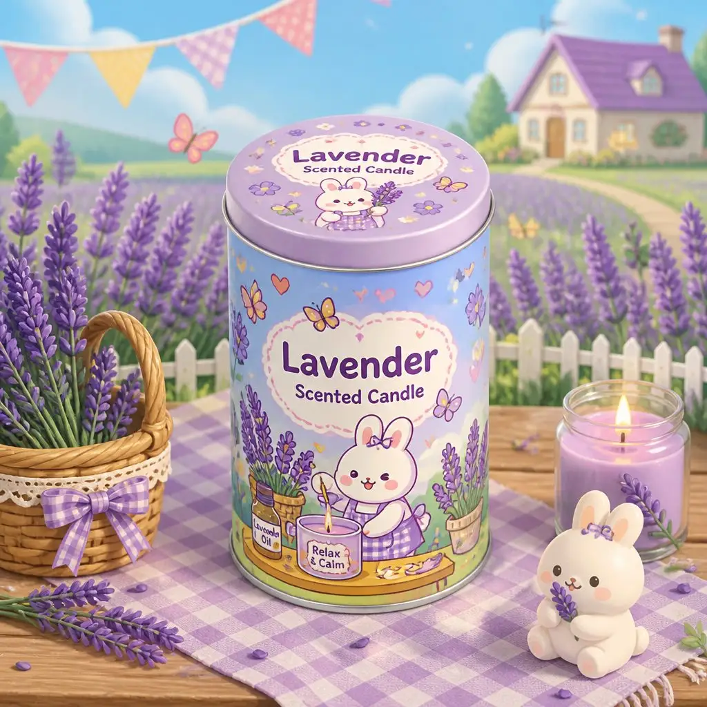
This square tea tin with a double lid is a clean example of the structure doing the premium work before any decoration is added. The same logic applies outside food: this scented candle tin is designed to stay in use as a keepsake box after the candle burns down. For a full comparison of every closure type, read our tin can lid types explained guide.
| Structure option | Best for | Relative cost | Main risk |
|---|---|---|---|
| Ready-made round or rectangular | Food, storage, fastest to market | Lowest | Competitors can order the same body |
| Window lid | Confectionery, crafts, stationery | Low–medium | Cheap film scratches and yellows |
| Double lid | Tea, coffee, premium food | Medium | Slightly taller body needed |
| Magnetic closure | Gifting, cosmetics | Medium–high | Magnet must be specified at tooling stage |
| Fully custom shape | Signature products, high volume | Highest | Longest lead time; tooling is one-way |
Surface Finishes That Change Perceived Value
With structure fixed, you have one base finish and one contrast process to spend. That is the whole budget for how the tin feels. Spend it on contrast, not coverage.
Embossing and Debossing: The 1 mm Rule
Raised or recessed metal changes how a tin feels before a single word is read. It is the cheapest way to make the same artwork read as more expensive.
The production constraint is line width. Embossed lines and letterforms need to be 1 mm or wider to form cleanly in the tooling and survive handling without distorting. Finer detail than that needs a multi-level emboss, which is a bigger tooling commitment. This embossed cigar tin with a golden eagle emblem shows how much presence a single raised element can carry on a dark background.


Matte vs Gloss: Where the Contrast Actually Comes From
Here is the mistake to avoid: applying gloss to everything. Gloss-on-gloss reads as loud; matte-on-matte reads as flat. What reads as premium is the boundary between the two.
Specify a matte varnish across the whole body, then apply gloss (spot UV) only to the elements you want to pop — the logo, the product illustration, or a texture pattern. The difference is dramatic in person and, just as importantly, it photographs clearly, which is why spot-UV tins consistently perform better in e-commerce listings.

Metallic Inks and Gold Foil: When the Upgrade Pays
Metallic effects come in three tiers, and choosing the right one is mostly about volume:
- Metallic ink — printed like a normal ink, lowest cost, subtle sheen. Best for large areas and high volumes.
- Hot-stamp foil — a separate process, sharpest result, highest impact. Best for a logo or a border, not a full panel.
- Laminated foil paper — the full-metal look, best when the design is genuinely foil-led.
This square candy tin with gold foil detailing uses foil on a restrained cream ground — the restraint is what keeps it premium rather than gaudy. Gold and copper metallics read particularly well on matte black, cream, or deep green bases.

Colour Blocking With Two Spot Pantones
Full-colour photographic printing is expensive to set up and easy to get wrong on metal. A two-spot-Pantone design is cheaper to print, easier to match across production runs, and — because the palette is constrained — usually photographs better for social media.
The technique is simple: pick two hero colours, give them equal visual weight, and let shape and typography do the work. This colour-block geometric tin is a good reference for how little artwork a strong design actually needs.

Let the Tinplate Show
Not every panel needs ink. Leaving the natural tinplate exposed — as a border, a centre stripe, or the ground behind the logo — creates a metallic accent with zero ink cost and signals an eco-friendly, less-coated aesthetic that resonates with natural and organic product lines.
This blank unprinted storage tin is the extreme end of that idea: no print at all, just form, material and a laser-etched mark.
| Finish | What it does | Cost impact | Watch out for |
|---|---|---|---|
| Matte varnish | Softens reflections, reads premium | Low | Can look dull without a contrast element |
| Gloss varnish | Maximises colour punch | Low | Fingerprints show on dark colours |
| Spot UV | Gloss-on-matte contrast | Low–medium | Registration must be tight or edges blur |
| Metallic ink | Sheen at print cost | Low–medium | Weak on light backgrounds |
| Hot-stamp foil | Sharpest metallic result | Medium | Separate setup; best in small areas |
Anatomy of a Printed Tin: Know What You Are Paying For
Most quoting confusion comes from buyers not knowing which of these layers are included. Five layers decide how the design looks, feels and survives.
Cross-section diagram of a printed tin showing tinplate base, white basecoat, lithographic inks, varnish and emboss depthThe five layers of a printed tin wall — and the interior lacquer most buyers forget to ask about.
From the metal outwards:
- Tinplate steel base — commonly around 0.23 mm for bodies. Leaving it unprinted is a legitimate design choice, not a cost cut.
- White basecoat — hides the metal and evens the surface so your Pantones land accurately. If a supplier skips it to save money, every colour above it shifts.
- Lithographic inks — four-colour process plus up to two spot colours is the efficient sweet spot for most brands.
- Varnish — matte, gloss, or spot UV. This is the layer that creates the contrast described above.
- Emboss depth — a tooling property, not a print property. It must be agreed before the mould is cut.
And one layer on the inside: a food-grade interior lacquer, clear or gold, is standard for food contact. Printing the inside of the lid runs on the same press pass as the exterior, which makes the inside-lid reveal one of the cheapest delight upgrades in packaging.
Details That Keep the Tin in Use
Interior Linings and Fitted Trays
The inside of the tin is the first thing a customer sees on opening and the last thing they forget. A painted interior in a brand colour, a foam insert, or a fabric lining turns a container into an unboxing.
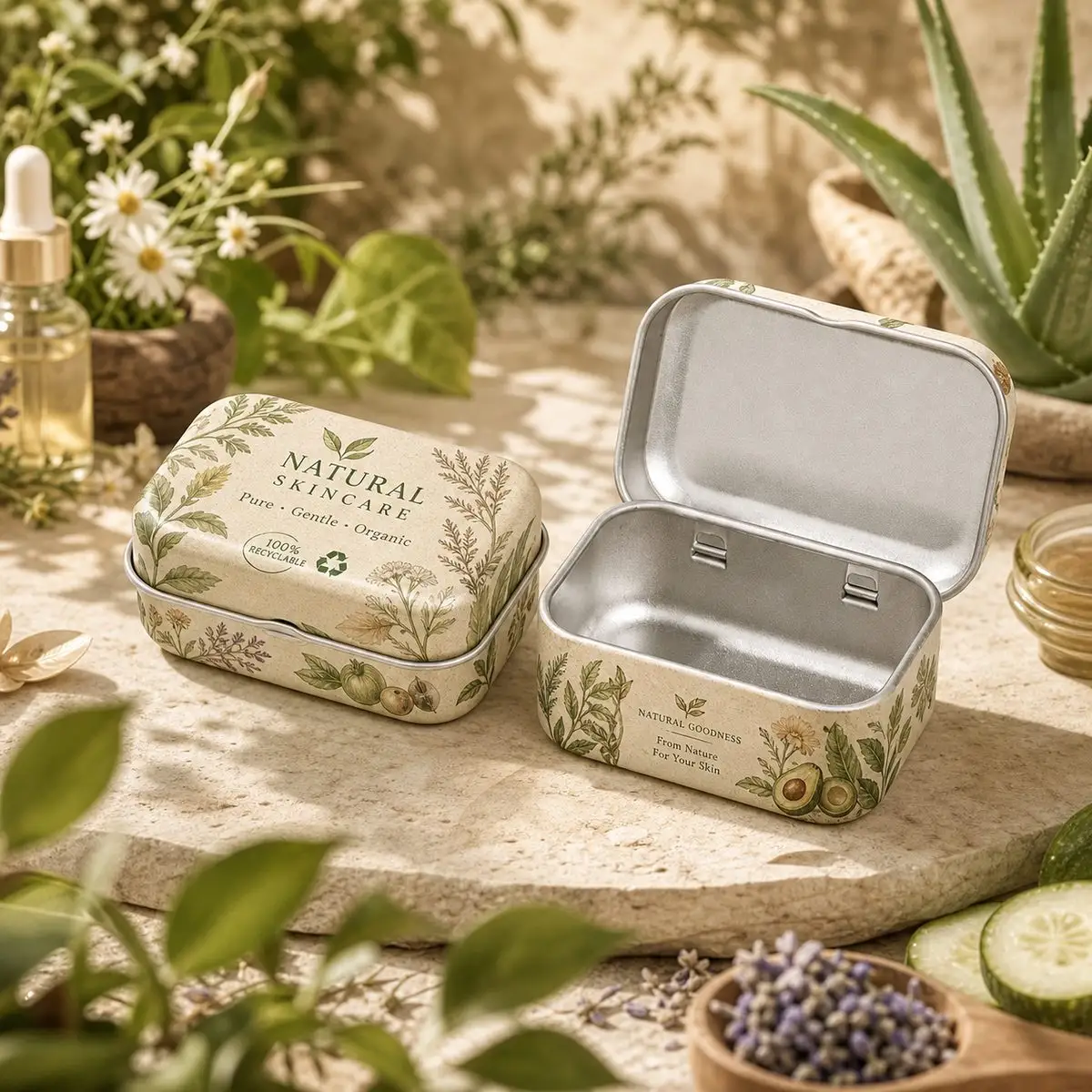
For fragile contents, specify a fitted tray or divider rather than loose filler — it protects the product and forces the unboxing to look composed every time. This herbal skincare storage tin shows the difference a printed interior and a fitted insert make to a small-format product.
Inside-Lid Printing: The Free Reveal
Because the lid interior prints on the same pass as the exterior, continuing your artwork or hiding a message there costs nothing extra in print setup. Customers consistently respond to the reveal moment, and it costs less than any other upgrade in this list.
Illustration and Collectible Series
A recurring illustrated character or a numbered series gives buyers a reason to purchase again, and illustrated tins are disproportionately shared on social media — where the packaging is the product photo.
Commission artwork at the tin's actual print resolution, and design the series so each piece stands alone but reads as a set on a shelf. This collectible illustration tin series is a strong reference: one visual system, many tins, each collectible on its own. Browse more in our gift tin cases gallery.

The Decision Flow, Visualised
Decision flow diagram matching packaging goals to structure, finish and detail choicesPick the row that matches your number-one goal, then stop adding. One structure + one base finish + one contrast process + one detail upgrade is a complete design.
Troubleshooting: What Goes Wrong and What to Ask
Most tin design failures are specification failures, not design failures. Put the right sentence in the brief and the problem disappears.
| Symptom | Likely cause | What to put in the brief |
|---|---|---|
| Sample looks different from the approved proof | Colour approved on screen, no hard proof | "Physical colour proof with Pantone references before tooling." |
| Embossing cracked the ink film | Emboss too deep for the ink coverage | "Confirm emboss depth against ink coverage; lines ≥1 mm." |
| Print looks dull next to the Pantone | White basecoat skipped or uneven | "Confirm white basecoat on every printed panel." |
| Tins arrived dented | No inner packing specification | "Carton count, inner box spec, and drop-test requirement." |
| Lid feels loose after a few uses | Tolerance mismatch on plug or clasp | "Lid tolerance spec plus a cycle test on the sample." |
| Window yellowed or scratched | Wrong window material | "Anti-scratch, food-contact grade PET/APET." |
Copy This Design Brief (Saves Two Rounds of Quoting)
Suppliers quote faster and more accurately when the brief answers their questions in order. Paste this, fill the brackets, and you will skip the usual back-and-forth:
PRODUCT & CONTENTS Product: [e.g. loose-leaf tea / candles / chocolates] Net weight or volume: [g / ml] Fragile or sealed food contact? [yes/no — if food, name the market] STRUCTURE Shape: [round / square / rectangular / octagonal / custom] Source: [ready-made mould / modified / fully custom] Lid system: [slip / double / magnetic / flip-top / window] Size target: [diameter or L×W×H in mm] FINISH Base varnish: [matte / gloss] Contrast process: [spot UV / emboss / foil / none] Spot colours: [max 2, with Pantone codes] Unprinted areas: [state exactly which panels stay raw] INTERIOR & PACKING Interior: [clear lacquer / gold lacquer / printed] Insert: [none / foam / fitted tray / divider] Inside-lid print: [yes/no] Carton count & drop test: [pcs/ctn, ISTA level] COMMERCIAL Target order quantity: [units, and reorder intent] Budget tier: [ready-made / modified / custom tooling] Required artwork files: [AI/PDF, CMYK + spot, dieline confirmed] Deadline: [sample date / bulk ship date / market launch]
What It Actually Costs — and What Actually Drives the Price
Four things move the price of custom tin packaging, in this order of impact:
- Tooling. A ready-made mould removes the largest single cost from the project. This is why our mould library — over 4,000 ready tin box moulds across tea, gift, candle, candy, coffee and stationery categories — is the fastest cost lever available.
- Order quantity. Unit price falls steeply with volume, but a ready-made mould keeps the minimum order low enough for a first market test. Our low-MOQ custom tins guide covers the strategy.
- Number of print colours and processes. Every spot colour, foil pass and emboss level is a separate setup. Two spot colours with one contrast process is the efficient ceiling for a first run.
- Inserts and secondary packing. Foam, trays and dividers are often quoted separately. Deciding them late is a common cause of a "surprise" final quote.
For the full arithmetic, read our custom tin can cost breakdown.
From Idea to Production in Days, Not Months
The traditional path — find a mould, brief a designer, wait for renderings, revise, then quote — takes weeks before a single sample exists. The platform path compresses it:
- See the shape. Browse the tin box mould library to pick a real structure instead of imagining one.
- Generate the mockup. Use the AI tin can mockup generator to see your artwork on the actual body in minutes — free, before any tooling commitment.
- Swap materials realistically. The AI material preview tool shows the same design in matte, gloss, metallic and brushed finishes so you can compare before quoting.
- Create the artwork. The AI artwork composer produces label artwork that already fits the print area.
- Quote and sample. Send the brief above through custom tin packaging and get a quote against a real mould, not a guess.
If you are sourcing from China for the first time, our custom tin box sourcing guide for importers covers the full supplier workflow.
FAQ
How much does custom tin box design cost?
Design and sampling are the small part. The largest single cost is tooling for a custom shape — which you avoid entirely by starting from a ready-made mould. After that, unit price is driven by order quantity, the number of print colours and processes, and inserts.
What is the minimum order for custom tins?
Using a ready-made mould keeps minimum order quantities low enough for a first market test. Fully custom tooling usually requires a larger commitment to pay back the mould fee — ask the supplier to state the break-even quantity before you commit.
How long does custom tin packaging take?
Ready-made mould with confirmed artwork moves to sampling quickly and bulk production in weeks. A fully custom mould adds tooling time to the front of the schedule. The fastest path is: pick an existing mould, confirm artwork completely, then start tooling.
Is embossing or hot stamping better for a logo?
Embossing adds depth you can feel; hot stamping adds a sharp metallic you can see. On a matte background, embossing alone often reads more premium. Foil wins when the logo is small and needs maximum contrast. They combine well when the embossed area also carries the foil.
Do window cutouts affect freshness?
Only if the window is unsealed. A properly fitted transparent PET or APET insert behind the cutout keeps the tin dust-tight and food-safe while still showing the product.
Can I use my own artwork, and what file format do I need?
Yes. Suppliers need vector artwork — AI or print-ready PDF — in CMYK plus any spot colours, with the dieline confirmed before tooling. Ask for a dieline template for the specific mould before you brief a designer; it prevents most rework.
Which finish photographs best for e-commerce?
Matte base with a spot-UV or foil contrast element. The contrast creates a highlight the camera can pick up, whereas a uniformly gloss or uniformly matte surface reads flat in product photography.
How do I make sure the tin gets reused?
A double lid or magnetic closure, a printed interior, and a structure that works as storage. Tins that feel premium in the hand and look intentional on a shelf get kept; tins that feel thin get discarded.
Conclusion & CTA
Good custom tin box design is a sequence, not a list: a structure that matches the product, one base finish, one contrast process, and one detail that extends the tin's life past the first opening. Choose the row of the shortcut table that matches your goal, put the troubleshooting sentences in your brief, and let the market tell you which idea to scale next.
Ready to move? Browse 2,837 real tin packaging cases, pick a structure from 4,000+ ready moulds, generate a free AI mockup, then get a quote — from idea to production in days, not months.
About CNTINWORLD: an intelligent packaging design platform connecting moulds, real production cases, AI creativity, customisation and quotation in one workflow — tin packaging since 1997. From tea tins to candle tins, turn your idea into production-ready packaging in days.